Autumnal offerings
Colour is extremely powerful, so choose wisely when making decisions around your home decor, Mary-Anne Tobin advises.
6 March 2025
I can’t believe we are already entering autumn; thankfully summer came late, so we are able to enjoy the sun for a while longer.
Individuality is going to be huge this year, and the easiest way to express yourself is by using colour.
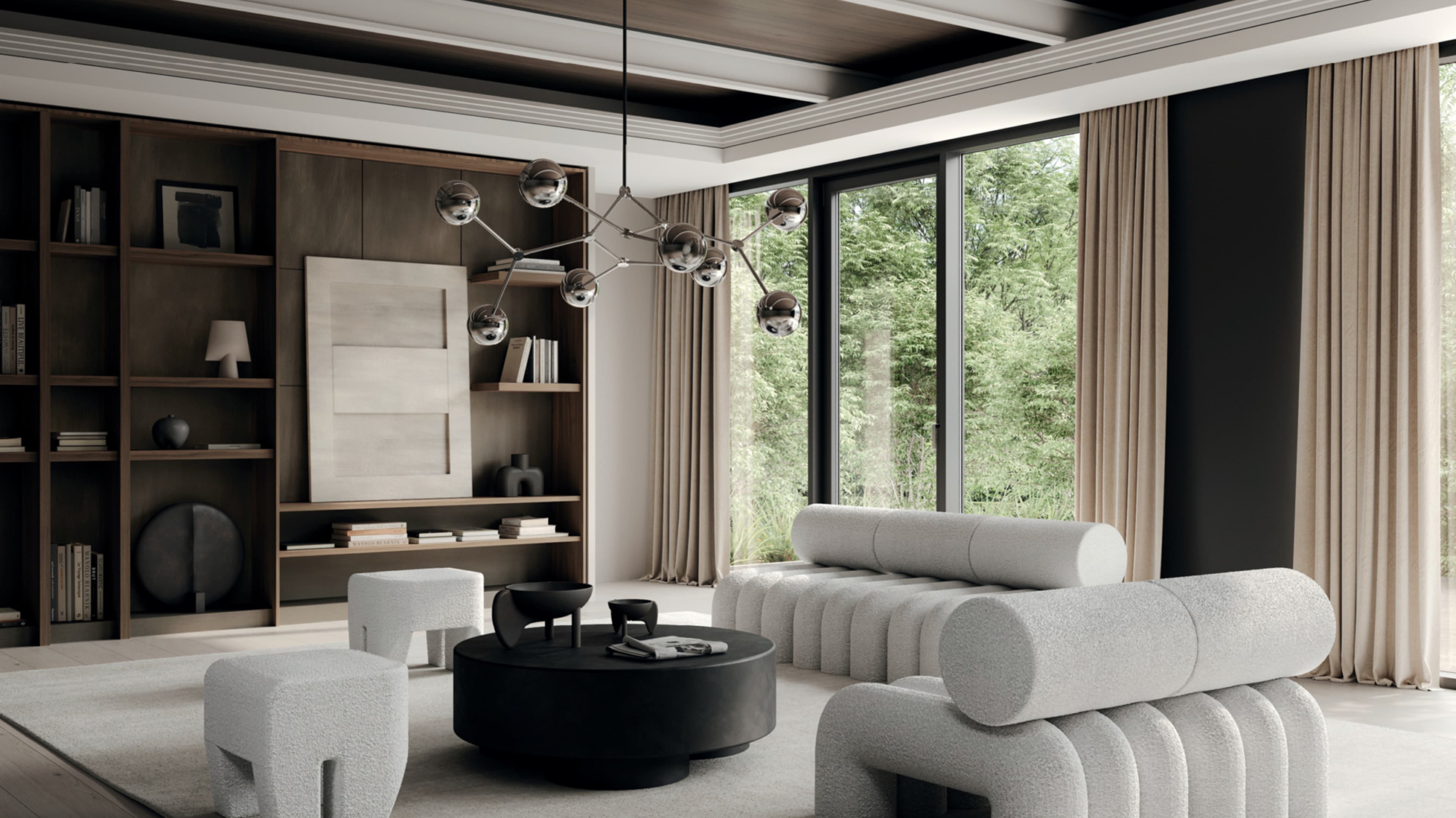
Blush and clay will be seen in decor: they are very muted, subtle, soft and grounding colours – maybe what you envision when you hear the words “love and warmth” or “laughter and softness”? Either way, they are gorgeous colours to weave into your home.
Colour psychology is important in the home, and there are some fascinating books regarding colours and personalities. “Biophilic design,” where we incorporate nature into our designs, will be key. Green resembles the growth of grass, trees, ferns; it’s a revival. Light blue speaks of calming skies, and deep blue is the colour of oceans.
I love to talk about the colour navy blue as being a psychologically “loyal” colour that represents trustworthiness. It is used by the police: even Cleopatra once wore blue. It can also be seen as royalty. This can have a strengthening influence in the home.

Be careful with colour
I am interested in how colour affects those who are neurodiverse, and each condition requires a different approach. Bright red may be overstimulating for someone with ADHD; even pink, which is just red with a touch of white, can be too much. A subtle green can help to balance pink. Ruby red can be quite intense, but on its own rather striking. Light and soft blues and greens seem to be the most relaxing of hues.
Given we are entering autumn, you will see a lot of new looks for the season; therefore, I have curated a few designer pieces to help lift your space. Cushions are the easiest way to transform a space; you can throw them on any chair for a slight pop of colour. Imagine coming home to a feeling of freshness without doing too much.
If looking to transform your office, consider a textured paint application or plaster. For the minimalist, it may give a little bit of luxury without using colour: sometimes the right undertone may be all that’s needed.
Secret of scent
Scent goes a long way too – I personally love having a bathroom spray and room spray, diffuser, or candle in each room. I tailor each scent to each room, from my children’s rooms, to my office, to my kitchen.
Slim Aarons has some nice art pieces which can really help to showcase your personality. Why not add some photography to your walls in simple frames, it is a real conversation-starter and people love to look at older photos as reminders of earlier times.
I am a fan of a beautiful vessel filled with autumn leaves. Autumn tones pair well with antique bronze and marble; you may also see some copper with sparks of orange flying through in the stores.
To sum it up, why not use a dash of colour this autumn. Textured walls with earthy hues are bound to see a resurgence. And next time you choose a paint swatch, ask yourself who lives or works here and how they would feel living with that colour. It isn’t just décor; colour is also a tool for making people feel good.
Informed Investor's content comes from sources that Informed Investor magazine considers accurate, but we do not guarantee its accuracy. Charts in Informed Investor are visually indicative, not exact. The content of Informed Investor is intended as general information only, and you use it at your own risk.


